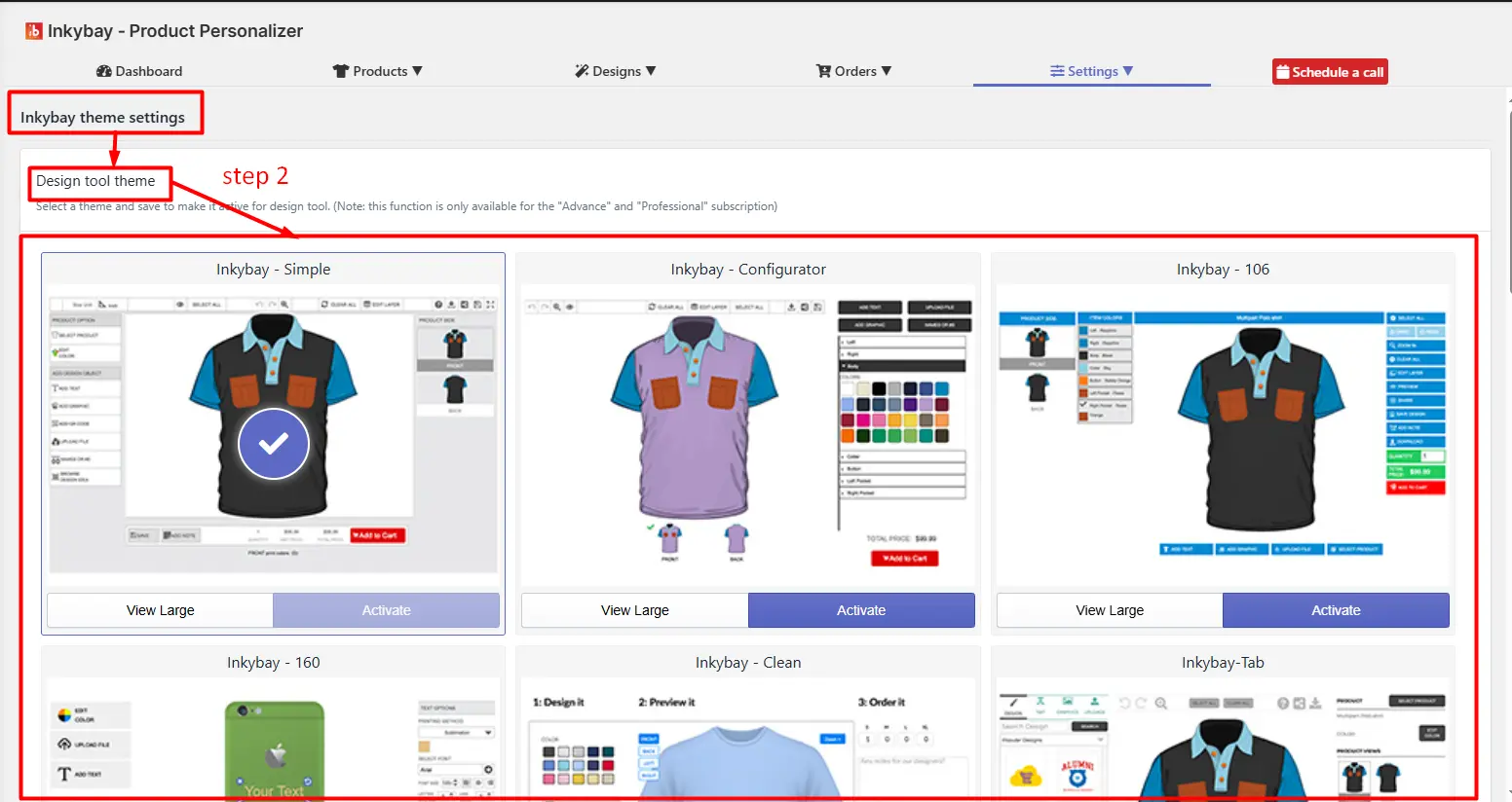
You get 10 ready-to-use, user-friendly, and customizable product designer tool themes. You can change each element of individual themes: layouts, buttons, and other interface elements to match your Shopify store’s branding and business needs.
📝Note This feature is available on the Advanced plan or higher. |
You can apply these themes to the designer page. By default, the designer tool page is on the ‘Inkybay-Simple’ theme.
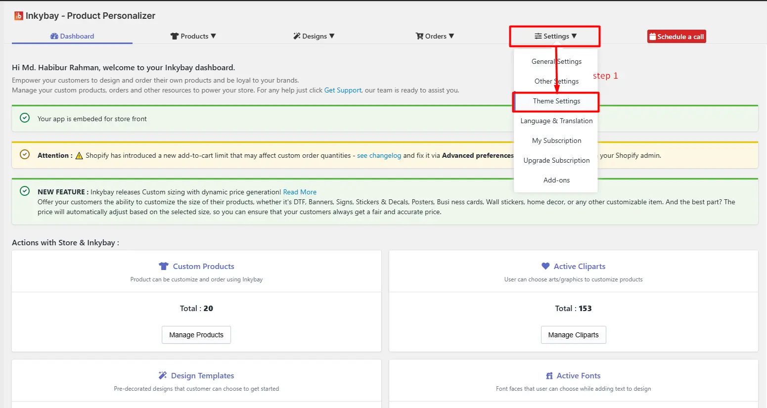
Step 1: Go to InkyBay Settings and click on Theme Settings.
Step 2: Choose a theme from the list.
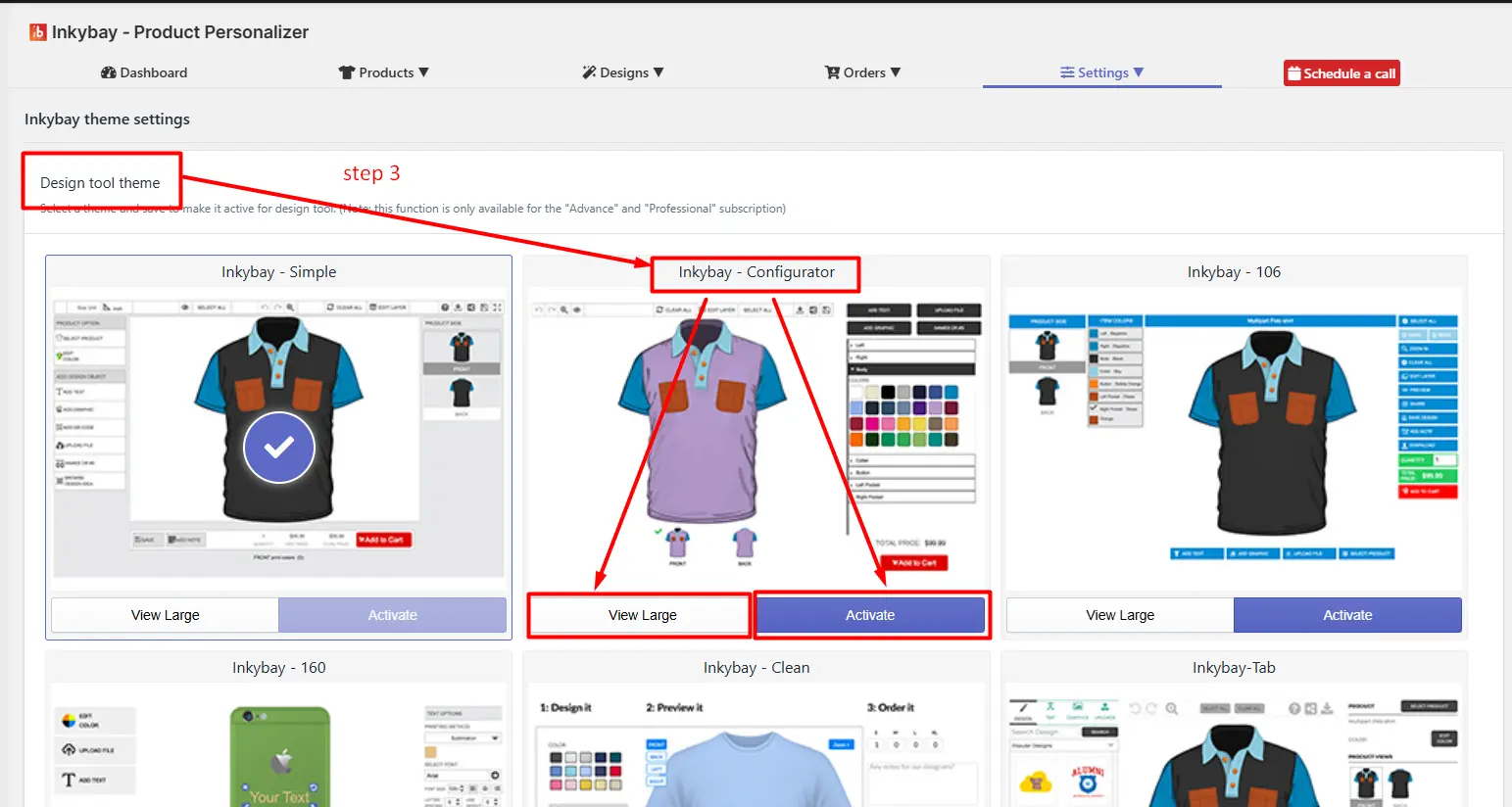
Step 3: Click on View Large to preview the theme or the Activate button to open the theme in the design tool.
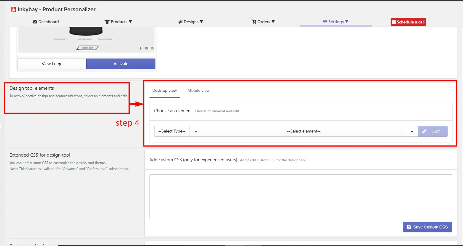
The setting allows you to control the visibility, behavior, and styling of UI components in the product designer interface.
It provides a centralized interface to activate, deactivate, and customize individual design tool elements (e.g., buttons, toggles, feature panels) for both desktop and mobile views.
Key settings are:
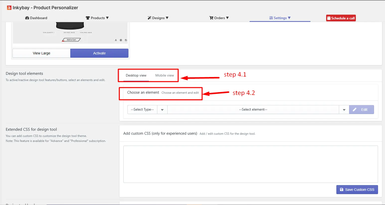
4.1 View Selection: Configure elements separately for different devices (desktop/mobile) to ensure responsive design behavior and optimized user experience.
4.2 Choose an element: Select a specific UI component (e.g., Toggle, Upload Button, Text Tool) to configure and edit its settings.
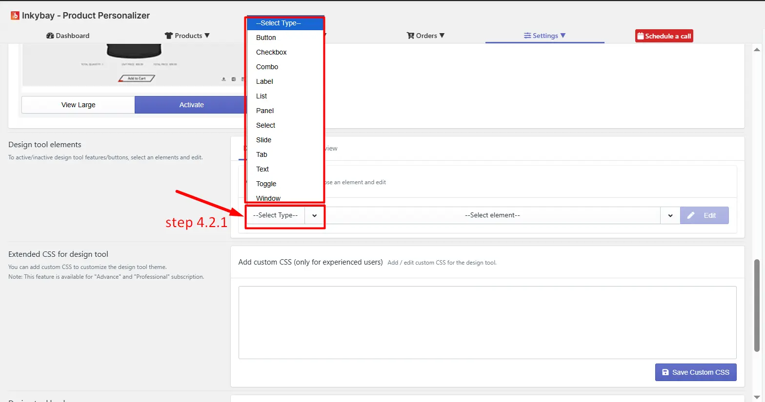
(4.2.1) Select Type: Click the Select Type to select a specific UI component (e.g., Toggle, Upload Button, Text Tool) to configure its settings. For example, in the image below, “Button” is selected.
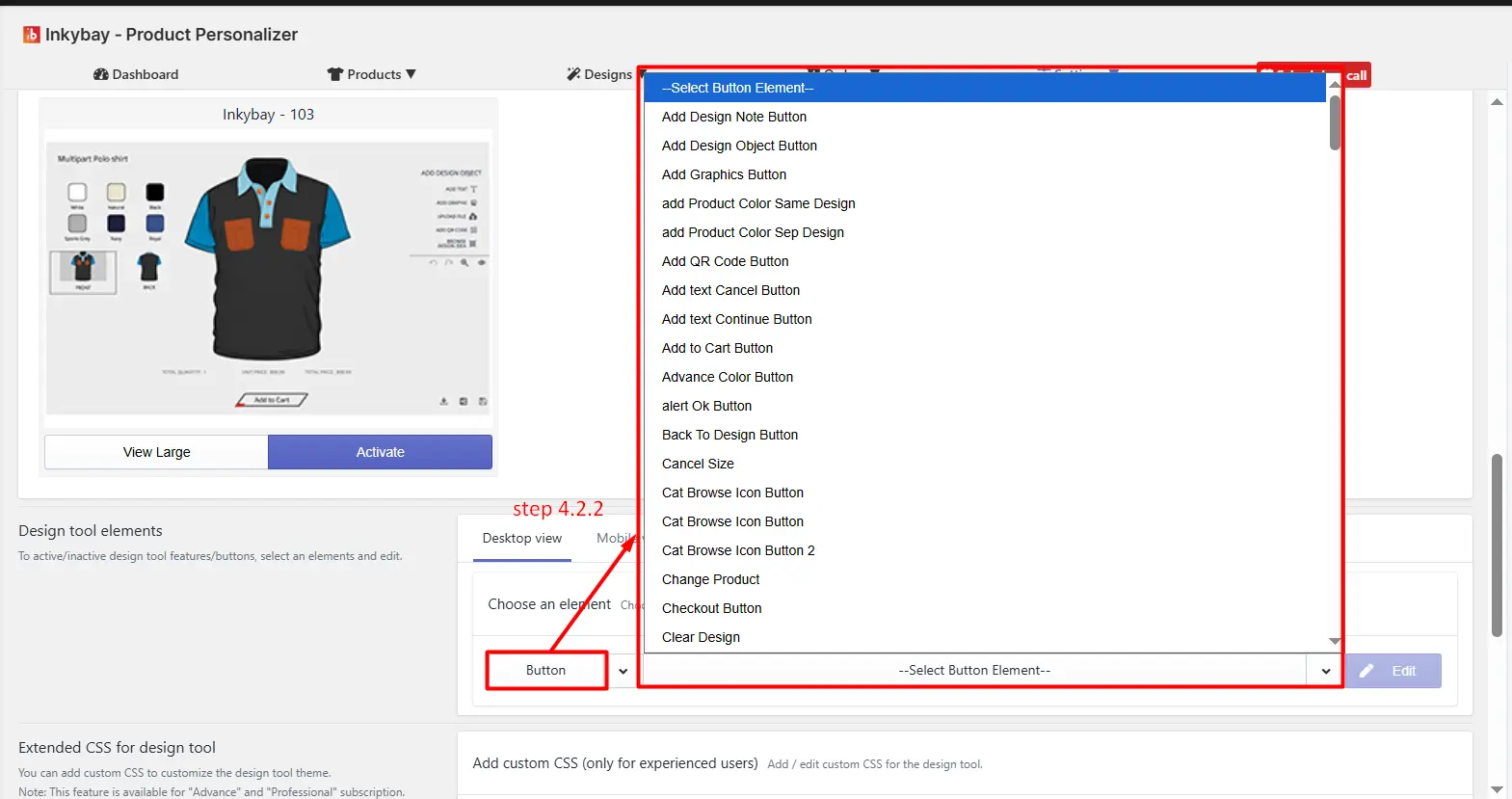
(4.2.2) Select element: Click the dropdown to select a specific element behavior.
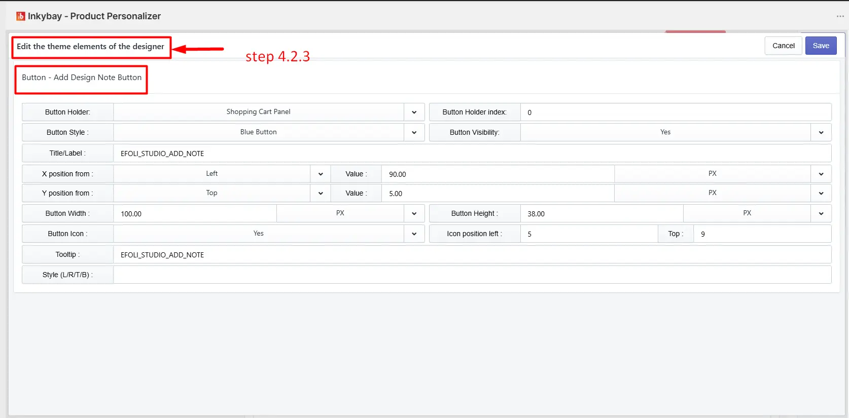
(4.2.3) Edit: Click the Edit button to modify its appearance.
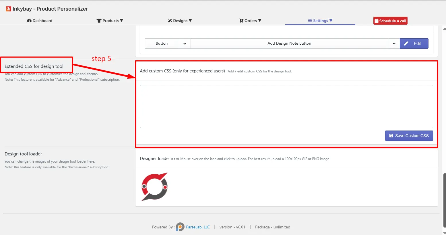
If you want to customize the design tool theme to match your store's outlook, simply add CSS code in the text field and click the Save Custom CSS button.
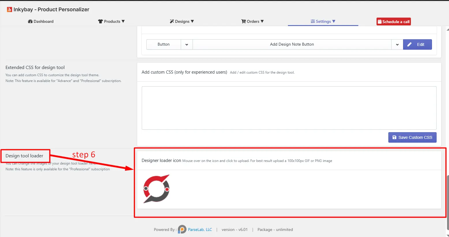
You can upload your own logo in the design tool loader. Note that it is available for professional & unlimited plan users.
Feel free to contact us whenever you face any issues or need assistance. We’re available 24/7. You can also reach us:
InkyBay app Live chat
Support ticket from the InkyBay app
Email to support@productsdesigner.com
 Getting Started
 Products
 Designs
 Templates
 Configuration
 Printing
 Orders
 Inventory Management
 Settings
 Packages
 Uninstallation
 Tutorials
 FAQ
FAQ