Category
 Getting Started
 Products
 Designs
 Templates
 Configuration
 Printing
 Orders
 Inventory Management
 Settings
 Packages
 Uninstallation
 Tutorials
 FAQ
FAQ 8 min to read
Last Update on 21 May 2026
Configuring Basic Settings in InkyBay
Overview
InkyBay's General Settings let you control the core configuration of your designer tool and product page. From here, you can manage your quote email, button styles, image quality, and more.
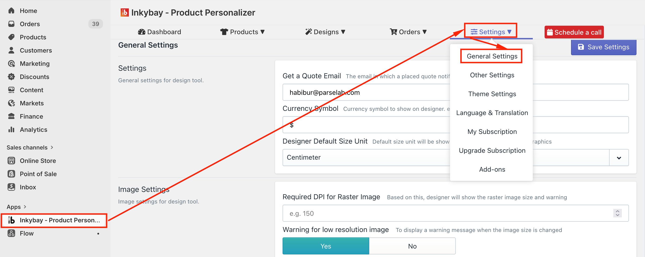
To access General Settings: Go to your InkyBay admin dashboard → Settings → General Settings
What You Can Configure
General Settings for Design Tool
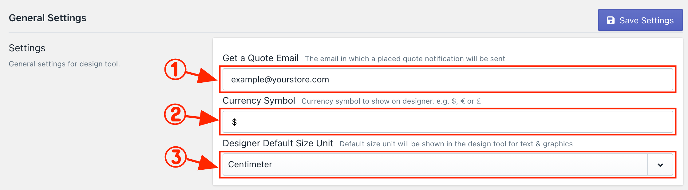
Set your quote request email address, currency symbol, and default size unit for the design tool.
-
Get a Quote Email: By default, InkyBay uses the email address associated with your Shopify store as the quote email. Whenever a customer submits a quote request, you'll receive an email notification at this address. You can update it at any time by replacing the existing email address with a new one.
-
Currency Symbol: By default, the currency symbol is set to "$". You can change it to any symbol that fits your store (e.g., ¥, £, €) to display the correct currency in the design tool.
-
Designer Default Size Unit: Centimeter is set as the default size unit for measuring image and text sizes in the design tool. To change it, click the dropdown and select either Inches or Feet.
|
Discover a detailed overview of the DesignLab |
Image settings for Design Tool
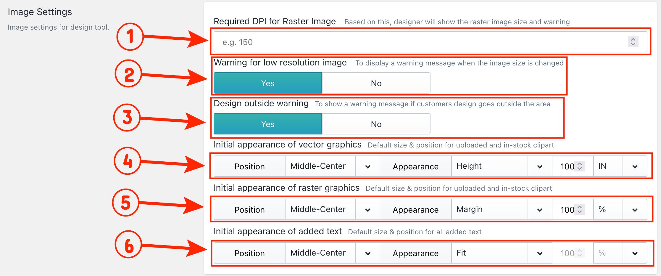
Image Settings is where you control print quality standards and the initial appearance of design elements in the design tool. Here, you can set DPI limits, enable warning messages for low-resolution images and designs placed outside the print area, and define the default position and appearance of images, graphics, cliparts, and text on the design tool.
-
Required DPI for Raster Image: Set a minimum DPI (dots per inch) requirement to ensure uploaded images meet your print quality standard. The default is 150 DPI and can be increased up to 300 DPI.
-
Warning for Low-Resolution Image: When a customer uploads or stretches an image below the required DPI, a warning message appears on the design tool. Customers can hover over the warning sign to see the recommended image size. Select No to hide this warning.
-
Design Outside Warning: A warning appears when any design element, photo, graphic, or text is placed outside the defined print area. Select No to hide this warning.
-
Initial Appearance of Vector Graphics Sets the default position and size of vector graphics, including SVG cliparts and in-stock graphics, when a customer first adds them to the designer tool.
4.1 Position: Choose where the graphic appears within the print area:
-
Left-Top
-
Left-Middle
-
Left-Bottom
-
Middle-Top
-
Middle-Center
-
Middle-Bottom
-
Right-Top
-
Right-Middle
-
Right-Bottom.
4.2 Appearance: Select how the graphic is sized when it first appears:
-
Fit: Fits the graphic inside the print area.
-
Cover: Expands the graphic to cover the entire print area.
-
Stretch: Stretches the graphic to fill the space.
-
Margin: Displays the graphic with a margin inside the print area.
-
Width: Adjusts the graphic based on width.
-
Height: Adjusts the graphic based on height.
4.3 Size Value & Unit: Set the default size value and select a unit from the dropdown (%, PX, IN, CM, or FT).
-
Initial Appearance of Raster Graphics: Sets the default position and size of raster graphics, including uploaded PNG, JPG images, and raster cliparts, when a customer first adds them to the designer tool. The same Position, Appearance, Size Value, and Unit options apply here.
-
Initial Appearance of Added Text: Sets the default position and size of text elements when a customer first adds a text layer to the canvas. The same Position, Appearance, Size Value, and Unit options apply here.
Customize Button Settings
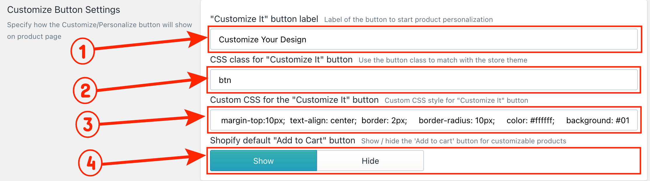
The Customize It Button is the main call-to-action that takes customers from your product page into the design tool. This setting lets you change the button label and style to match your store's look and feel.
-
Button Label: Enter your preferred text to replace the default "Customize It" label on the button.
-
Button CSS Class: To match the button style with your store theme, enter the HTML class of your Shopify theme in the text field.
-
Custom CSS: Add your own custom CSS to style the button as needed. You can add multiple CSS rules in the text field.
-
Shopify Default Add to Cart Button: When a product is made customizable in InkyBay, the default Shopify Add to Cart button is automatically hidden and replaced with the Customize It button. Click Show if you want to display both buttons on your product page.
|
🎯 Important If you use the Inkybay product options feature for your products, you must hide the default Shopify add to cart button to work it properly |
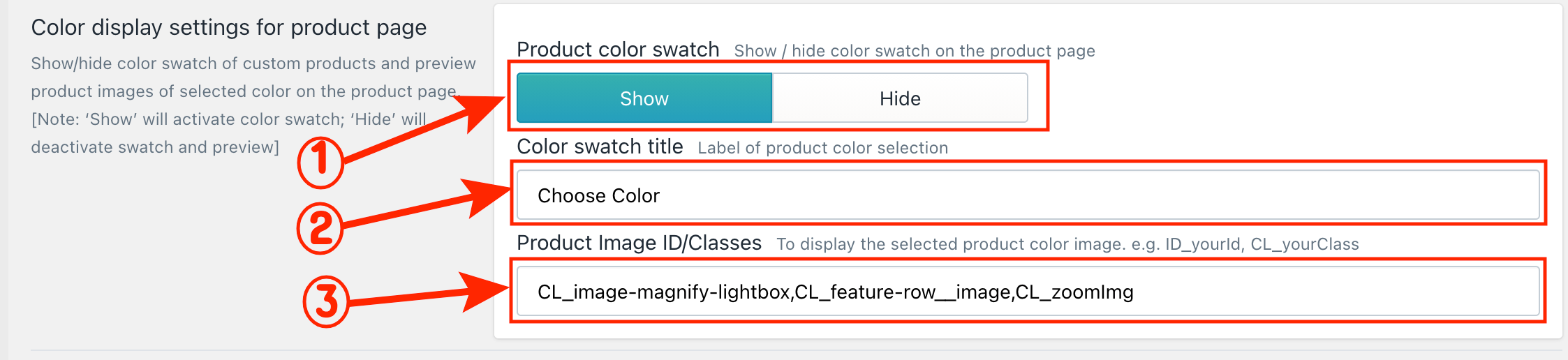
Color Display Settings for Product Page:
This setting lets you display product color variants as a color swatch on your product page. Customers can browse available colors and preview them before jumping into the design tool. The color they select will carry over when they open the product in the designer.
-
Product Color Swatch: Click Show to activate the color swatch on your product page.
-
Color Swatch Title: The default title is "Choose Color." You can rename it by replacing the existing title with your preferred one.
-
Product Image ID/Class: When a customer clicks on a color swatch, the product image should update to show the selected color. If the image is not changing, it may be due to your Shopify theme. To fix this, enter the product image ID or class from your product page in the text field.
Below, we’ve shared a color swatch preview from the product page.
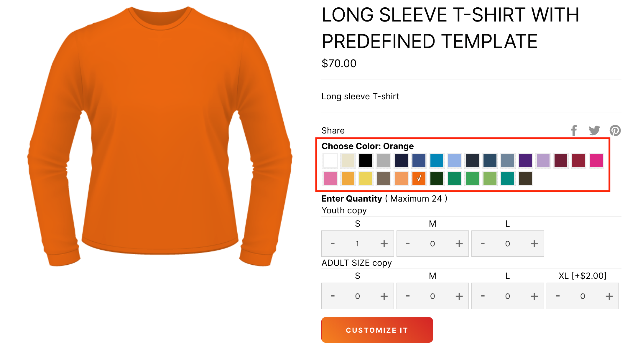
|
Discover more InkyBay’s Custom Color settings. |
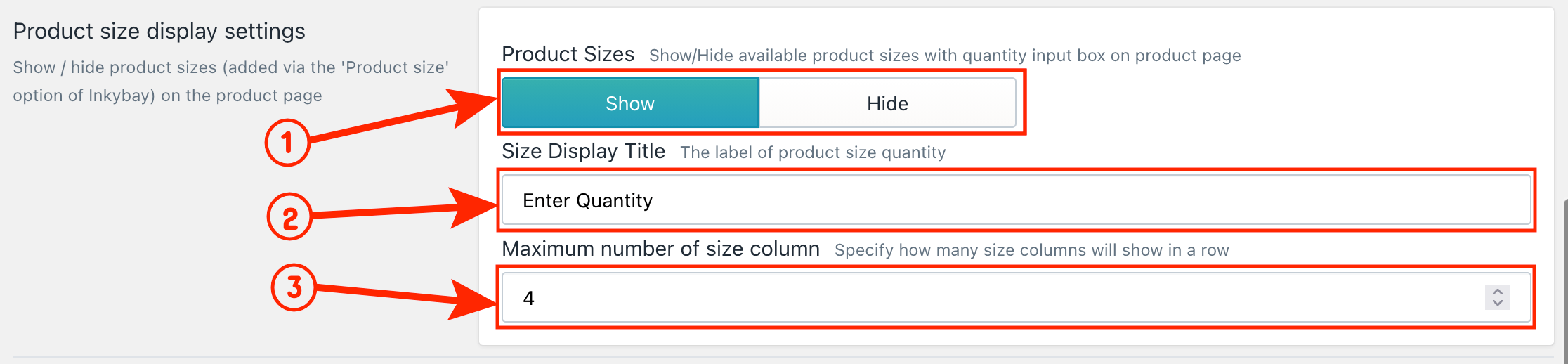
Product Size Display Settings for Product Page:
This setting lets you display product size variants on your Shopify store's product page. Each size option comes with a quantity box where customers can enter their required quantity. By default, the quantity is set to 0, and the section title is "Enter Quantity".
-
Product Size Display: Click Show to display the sizes on the product page, or click Hide to hide them.
-
Size Option Title: The default title is "Enter Quantity." You can rename it by replacing the existing title with your preferred one.
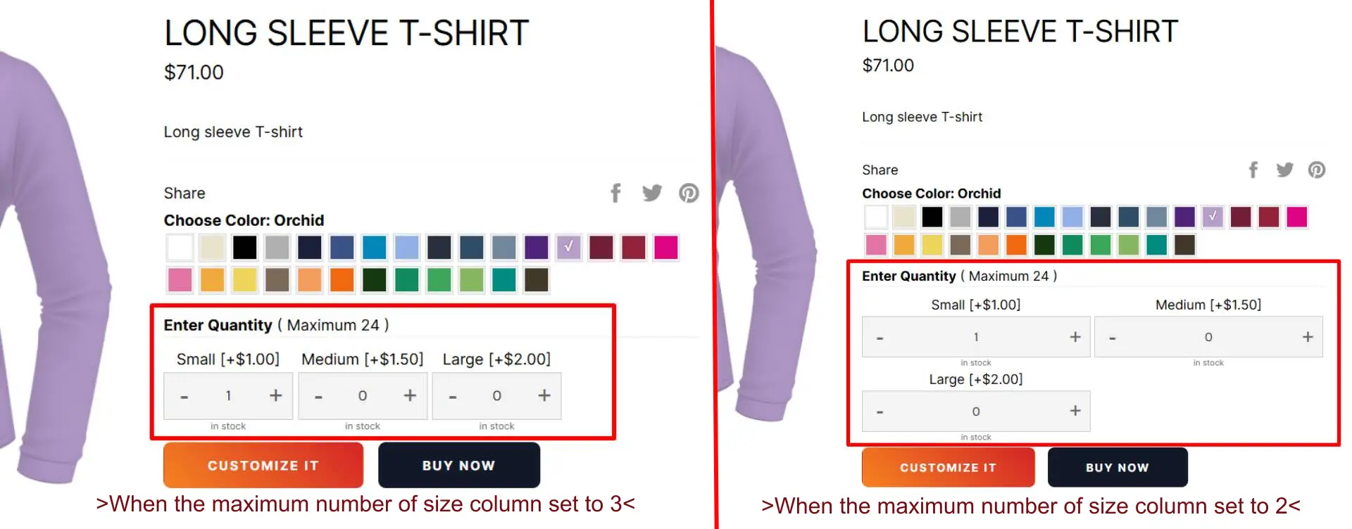
3. Maximum Number of Size Columns: Control how many size options appear per row.
For example, if you have 3 size variants and set the column limit to 3, all variants will appear in a single row. Like the image above, on the right side, 3 sizes are displayed in 3 columns and one row.
If you set the column limit to 2, sizes will display as two columns. Like the above image, on the left side 3 sizes are displayed in 2 columns, and the first two size variants appear in the first row, and the third is moved to a new row.
|
💡Note: To change the minimum quantity, go to the Printing Type setting of the product. |
Buy Blank Button Settings
This setting allows your customers to purchase a product without customization. This feature is important for merchants to offer both custom and standard (non-customized) products from the same product page.
-
Button Visibility: Click Show to activate the Buy Blank button on your product page.
-
Button Label: The default label is "Buy Blank." You can rename it by replacing the existing label with your preferred one.
-
Button CSS Class: To match the button style with your store theme, enter the CSS class of your Shopify theme in the text field.
-
Custom CSS: Add your own custom CSS to style the Buy Blank button as needed.
-
Allow Blank Purchase from Designer: Select Yes to allow customers to blank purchase the product inside the designer page, so customers can skip customization and purchase directly from there as well. If you select "NO", a warning will appear inside the designlab if the customer tries to purchase the product without customizing it.
🎯Important: To activate the BUY Blank button on the product page, it is required to activate/show both the product color swatch and the product sizes. |
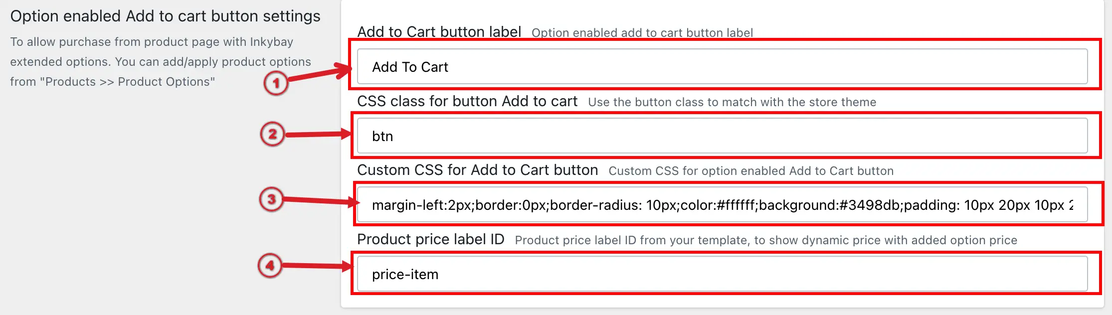
Option Enabled Add to Cart Button Settings
This button will appear on the product page when you set up your Product Only with Product options. You can manage the label, style, etc, from these settings.
-
Button Label: The default label is "Add to cart." You can rename it by replacing the existing label with your preferred one.
-
Button CSS Class: To match the button style with your store theme, enter the CSS class of your Shopify theme in the text field.
-
Custom CSS: Add your own custom CSS to style the Add to cart button as needed.
-
Product price label ID: If you want to display dynamic pricing on the product page, where the price updates automatically based on the selected size, color, or product options, you need to enter the product price element ID or class in this field. This allows InkyBay to locate the price element on your product page and update it in real time whenever a customer selects an option with an added cost.
Still, if you face any further issues or need help, feel free to contact us. Our support team will be happy to help you.
You can always reach us via
-
Support ticket from the Inkybay app
-
Live Chat in the Inkybay app
-
Direct email to support@productsdesigner.com
So, Good Luck! And happy selling with Inkybay.
Did this post help you?