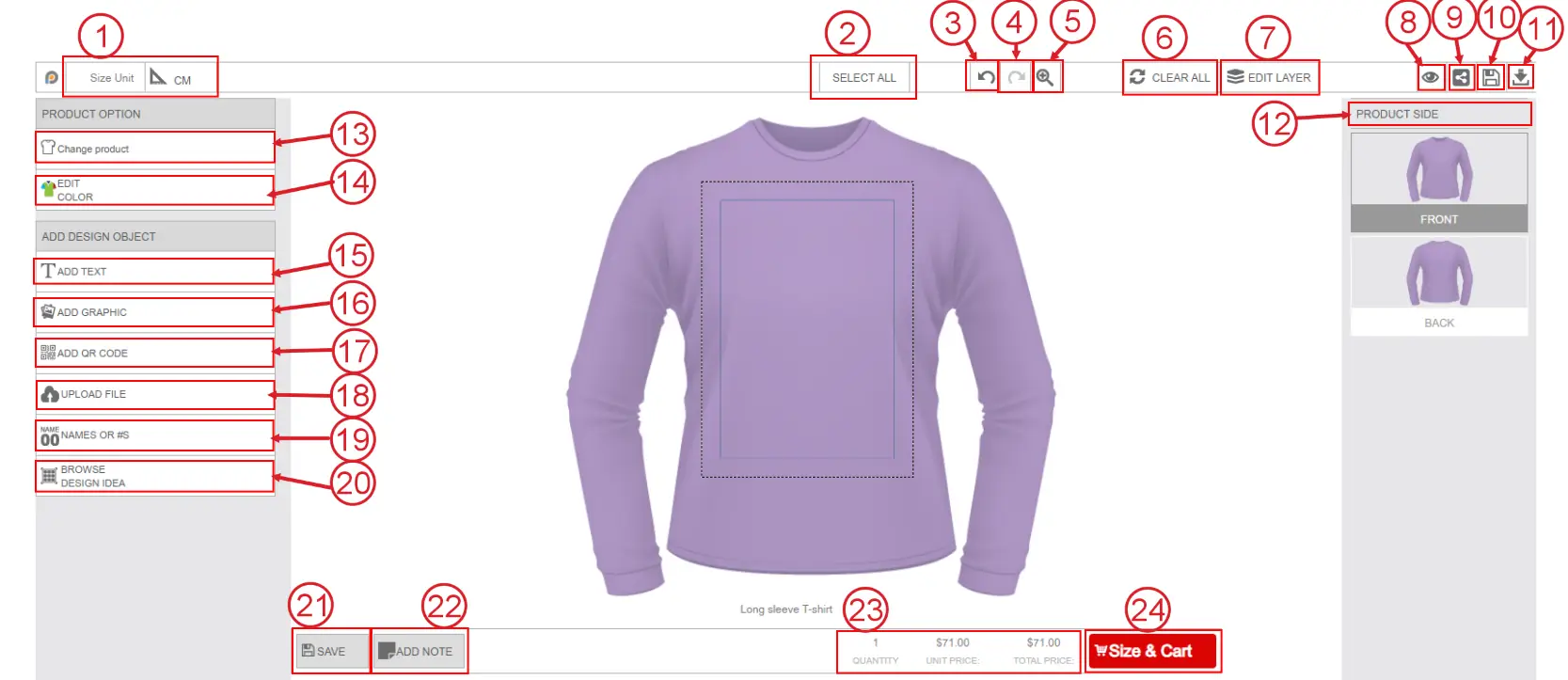
The InkyBay DesignLab is an interactive product customization interface that allows customers to personalize products directly from the storefront before placing an order. It provides a live design environment where users can add text, upload images, insert graphics, change product colors, and customize different product sides in real time.
DesignLab is designed to make the customization process simple, visual, and user-friendly for both customers and store owners. Customers can instantly preview their personalized products, while store owners can offer advanced product customization without requiring manual design communication.
The DesignLab supports a wide range of customization features, including:
Text personalization
Image and logo upload
Clipart and graphic addition
QR code generation
Multi-sided product customization
Dynamic pricing updates
Layer management
Product color configuration
Design save and share option
Size Unit
Displays the default measurement unit for the text and graphics that you set in your Inkybay general settings. It helps customers understand the exact design size. Click on the size unit to change it into inches or Feet.
Select All
Selects all design objects currently added to the canvas, including text, graphics, and uploaded images, for bulk editing or movement.
Undo
Reverts the last action performed in the designer.
Redo
Restores the previously undone action.
Zoom Tool
Allows zooming in or out of the product for precise editing and positioning.
Clear All
Removes all added design elements from the current product side.
Edit Layer
Opens the layer management panel where users can rearrange added designs, change the order, or remove any object, like the image below: 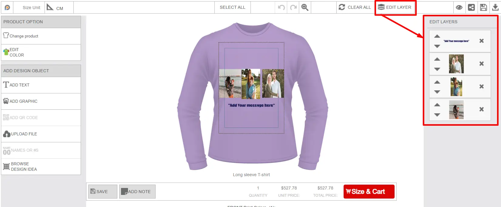
Preview
By clicking on this preview icon, the user can preview their designed product. Before placing the order, they can view how the product looks. Preview displays all the sides of the product, like the image below: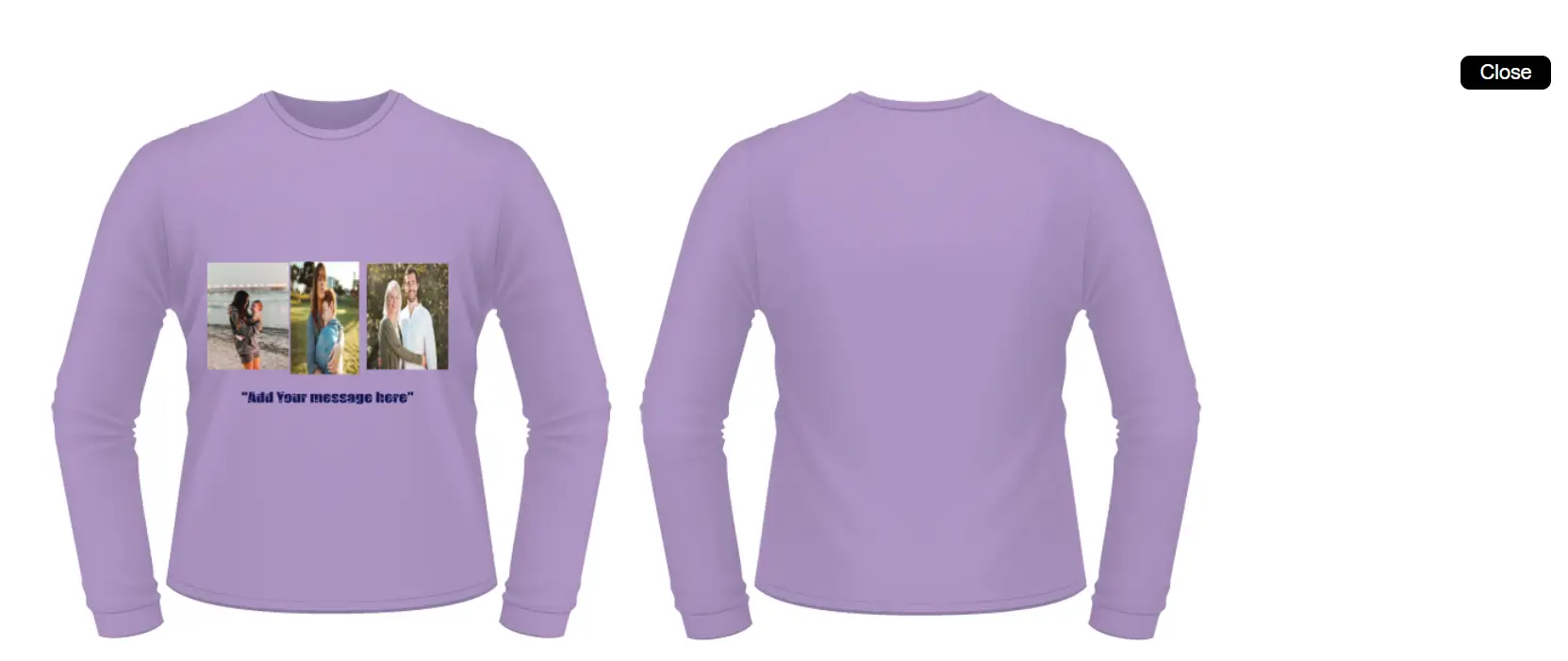
Share Design
The share option allows customers to share their designed product through different social platforms. 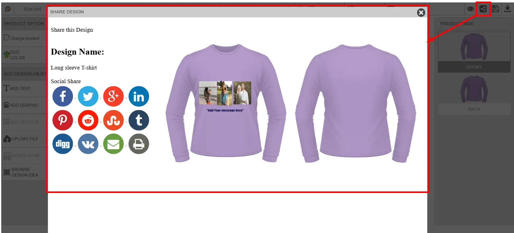
Save Design
Customers can save the current design for future editing or purchase it later. The customer will receive an email notification with the design link, and their saved design will be stored in Marchant’s Inkybay admin dashboard → Order → Customer Saved Design Section. 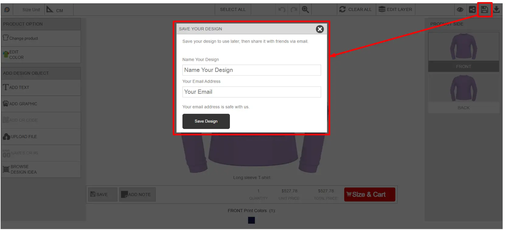
Download Proof
Customers can download a proof of the current customized design, like the image below: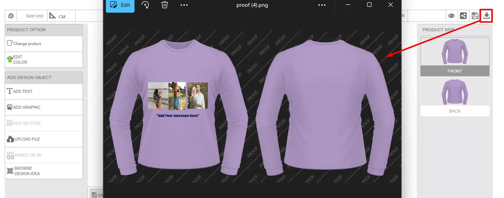
Product Side Panel
Displays all available printable sides of the product that you added while setting up the customized product, such as Front and Back. Customers can switch between sides and customize each side separately.
Change Product
Let's users switch to another product while keeping or adjusting the existing design setup. After clicking on the change product button, the user will get the available product collection and select the desired product, as shown in the image below.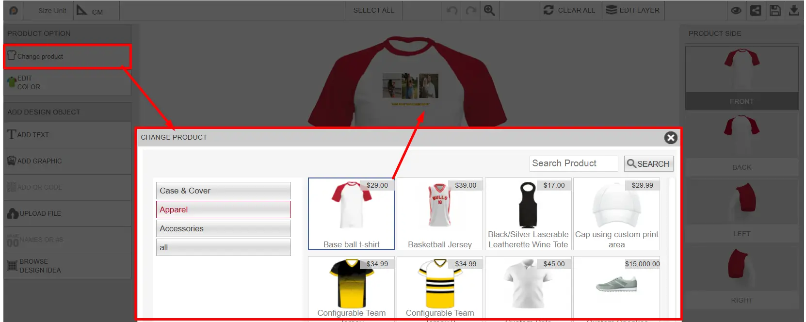
Edit Color
Allows users to change the product color or configurable panel colors depending on the product setup. Customers can select the desired color from the available color options, like the image below: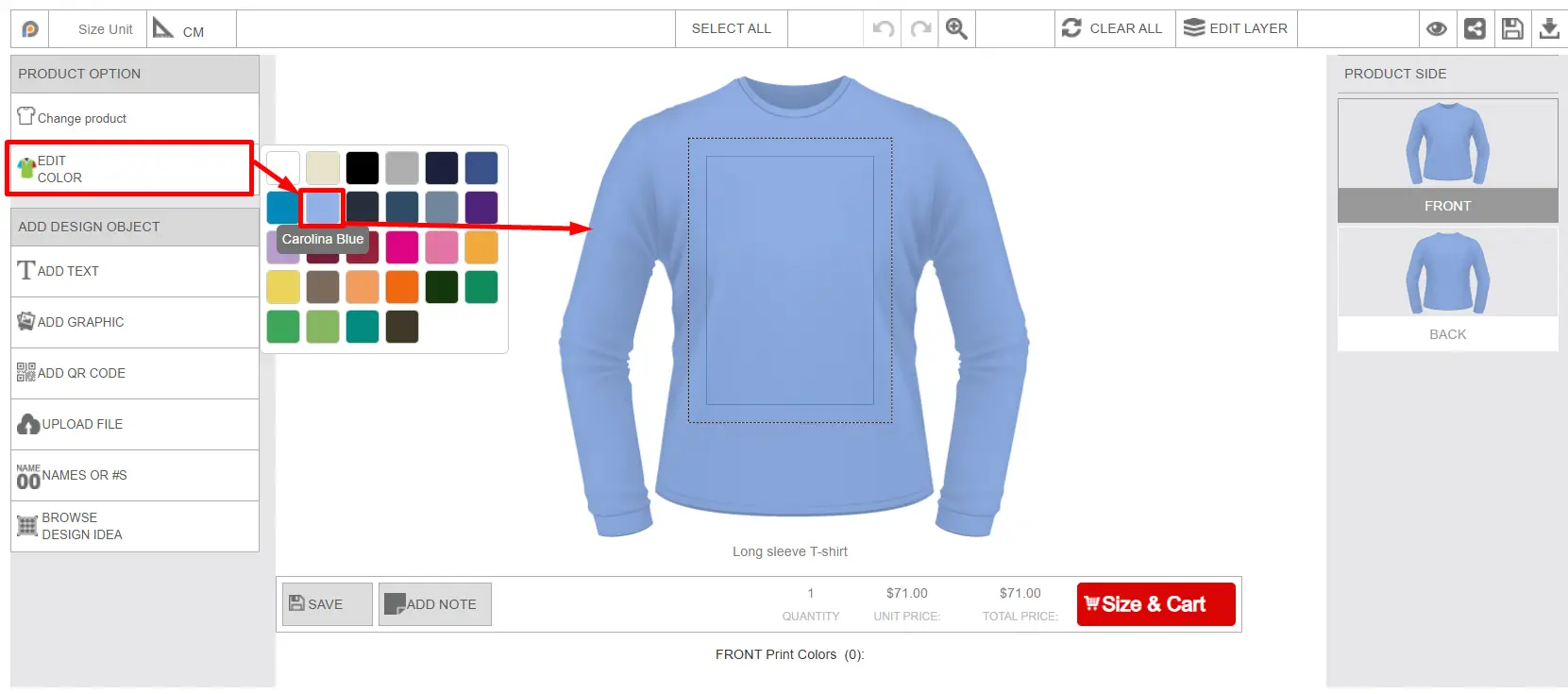
Add Text
Adds custom text to the print area. Customers can add text on the product and design the text with different design options below: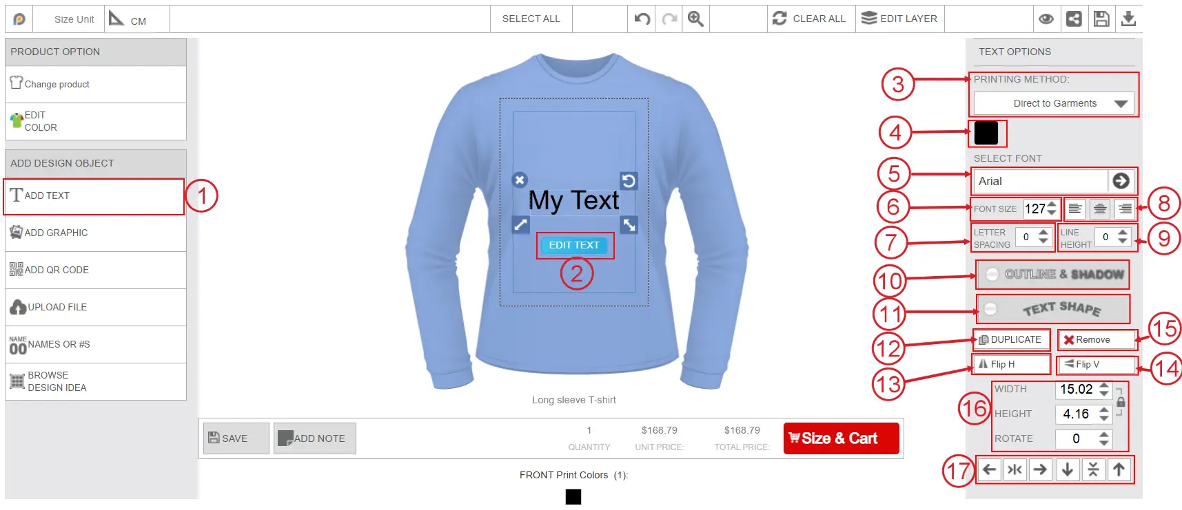
Add Text button
Customers can add custom text to the product design area by clicking on this button.
Edit Text
By clicking this button, customers can edit the default added text.
Printing Method
One printing type will show by default. If there are multiple printing types assigned to this product, the customer can select them from the drop-down list.
Text Color Picker
Customers can change the text color from here. After clicking on the color, all the available printing colors for the selected print type will appear, and customers can select from those colors.
Select Font
The default font will show in the select font field. After clicking on the font, all the available font categories and font list will appear like the image below. Customer can select their preferred font from the list. 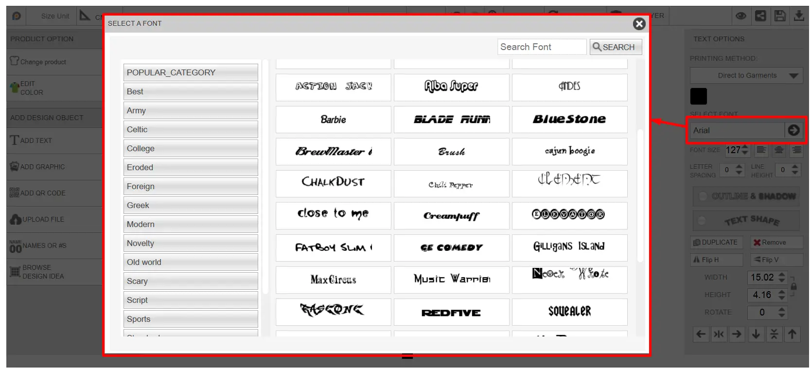
Font Size
Customers can increase or decrease the font size according to their preference.
Letter Spacing
Customers can adjust the spacing between letters.
Text Alignment
Customers can change the alignment of the text to the left, center, or right.
Line Height
Customers can adjust line height and the spacing between text lines.
Outline & Shadow
Customers can apply outline and shadow effects to the text. After clicking on the button, a small window appears, like the image below, to add the outline & shadow to the text.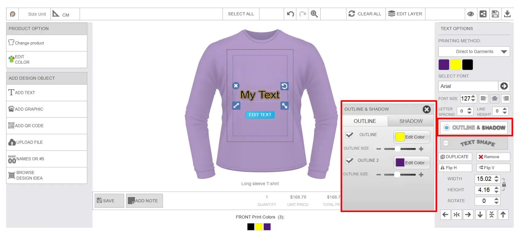
Text Shape
Customers can change the text shape to different styles, such as Vertical, Curve, Arch, and Flag. 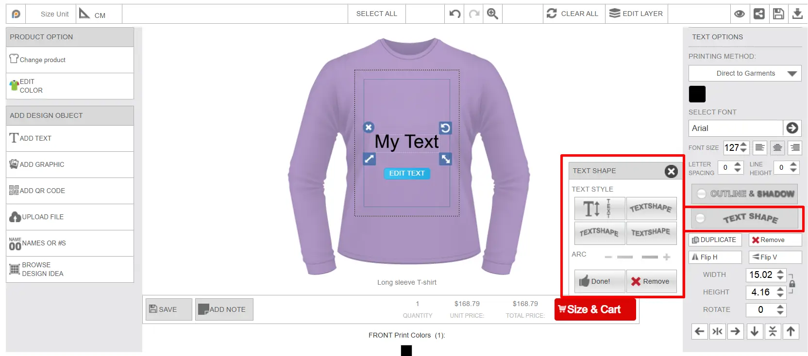
Duplicate
Customers can duplicate the added text by clicking on the duplicate button.
Flip Horizontal (Flip H)
Customers can flip the text horizontally.
Flip Vertical (Flip V)
Customers can flip the text vertically.
Remove
Customers can remove the selected text from the design area by clicking on the remove button.
Width, Height & Rotate
Customers can adjust the width, height, and rotation angle of the added text by adding the measurement manually in these fields.
Object Position Controls
Customers can change the layer position of the selected object, such as moving it left, right, top, or bottom.
Add Graphic
This button opens the clipart library, like the image below, from where customers can add graphics or clipart from Inkybay’s clipart library to the product.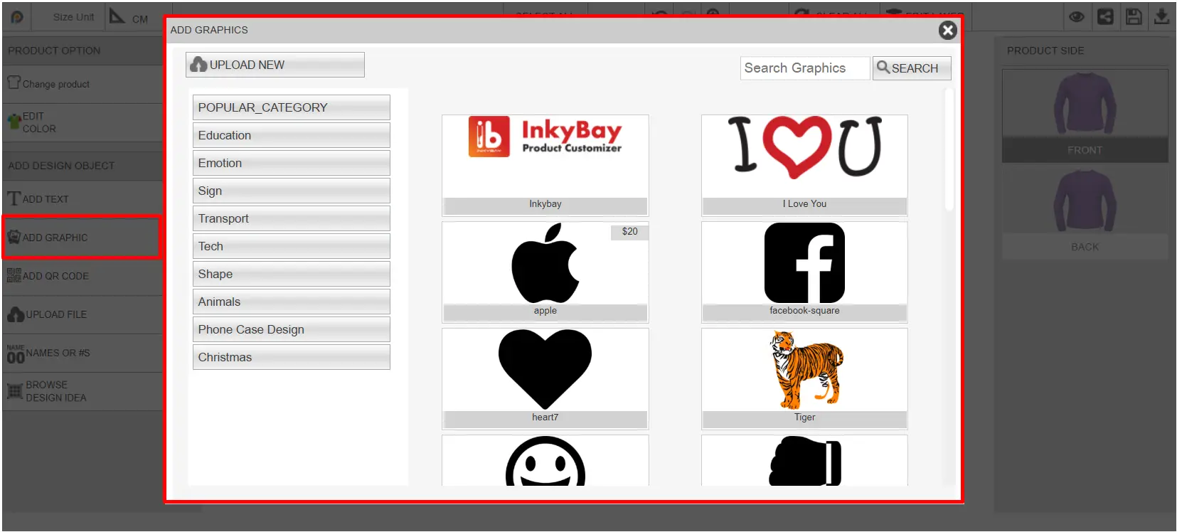
After adding the clipart, customers can change the print type, color, size, and other changes, like the text, from the object controls.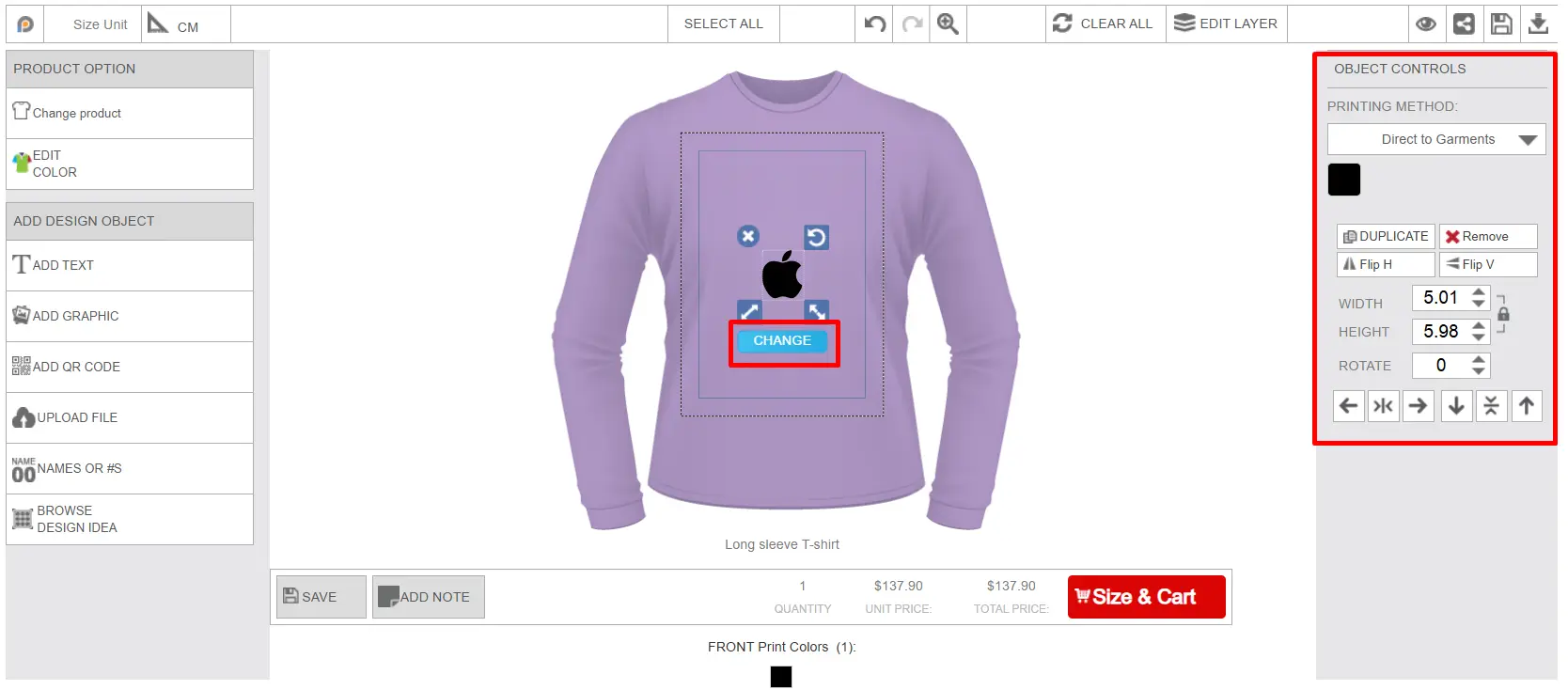
Add QR Code
Customers can generate a QR code in the design using custom text. After clicking on the button, a window will appear to add custom text, like the image below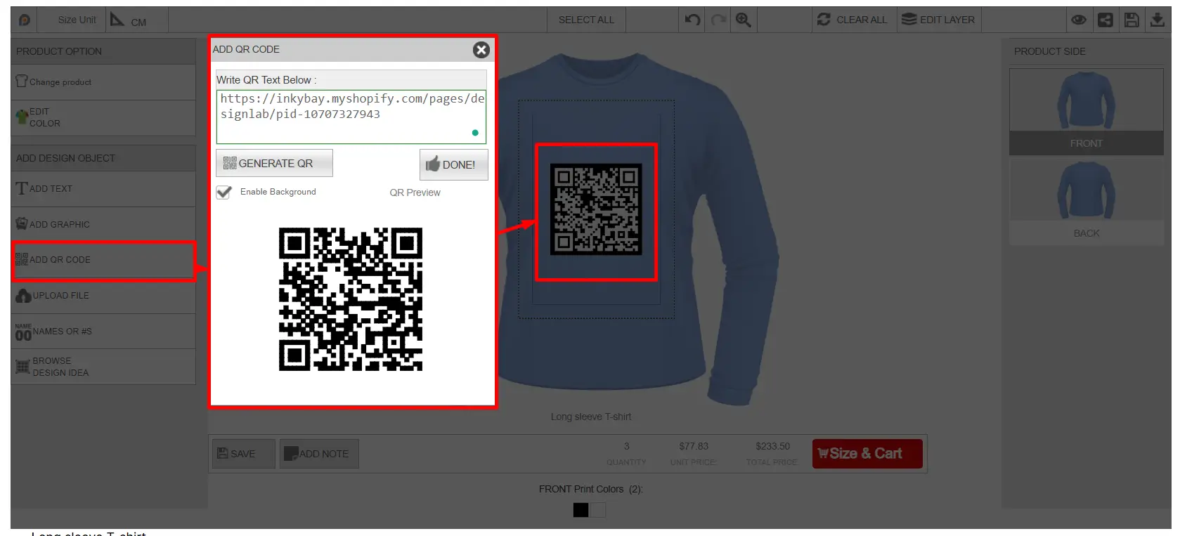
Upload File
Allows customers to upload their own images, logos, or artwork files to the product. After clicking on the Upload file button, the upload image window will appear like the image below. Click on the browse button to upload your artwork. Accepted File types are SVG, JPG, JPEG, PNG, GIF, and BMP.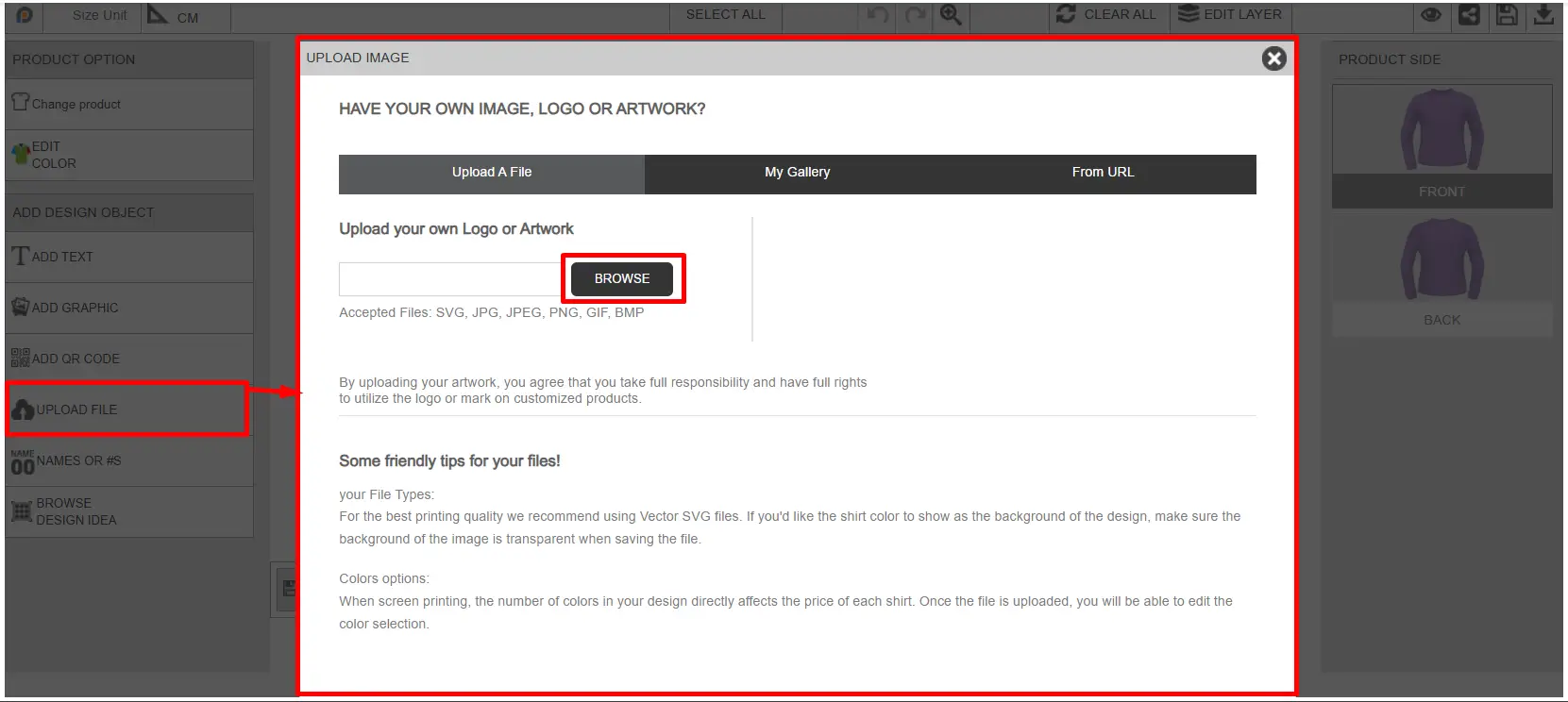
After uploading an image, the customer will be able to select color options, crop&mask, and the photo effect option, like the image below: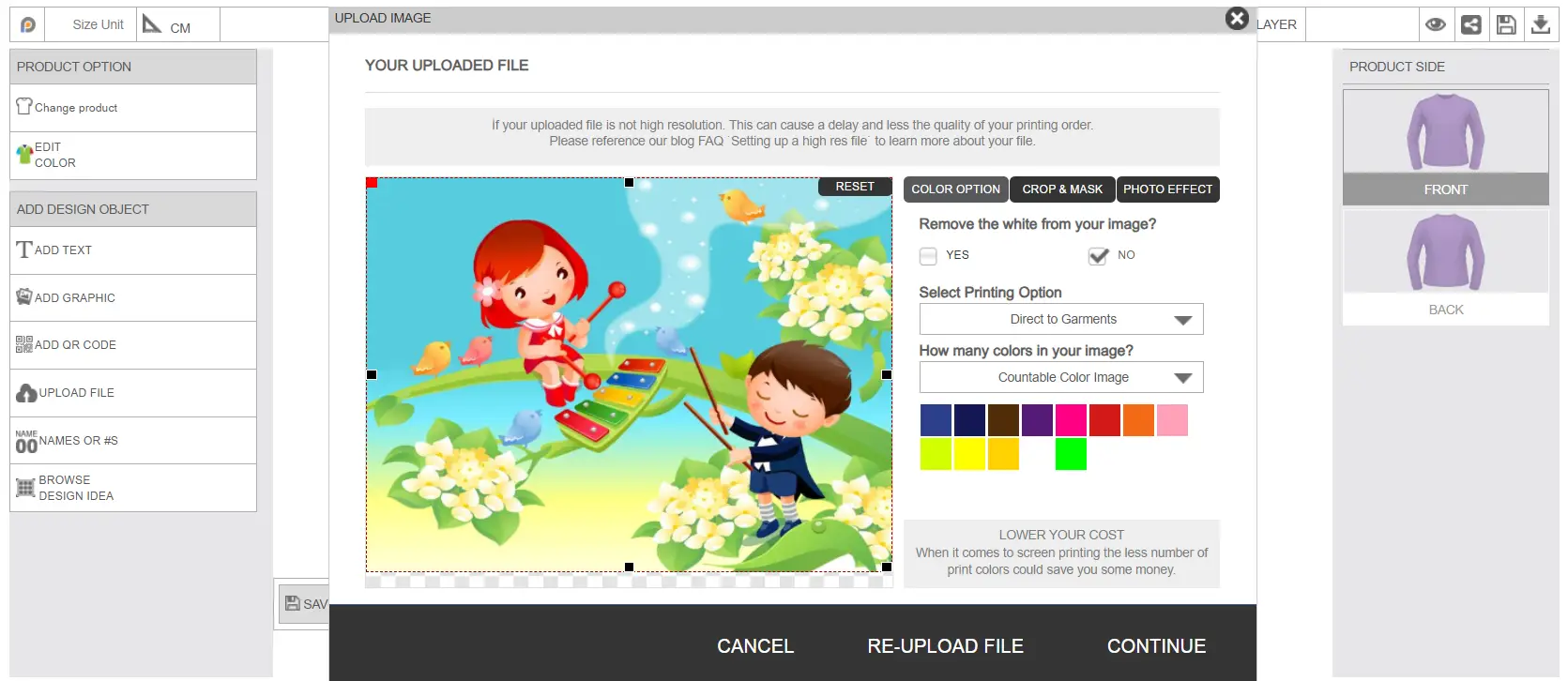
Color Option: From the color option, customers can remove any white part from the uploaded image, select the printing type, and choose how many colors are in the image. You(Marchant) can offer a full color option and a multi-color choosing option for color selection from your printing type.
Crop & Mask: Some default shapes will appear here. If customers select any shape, the image will be cropped into that shape. 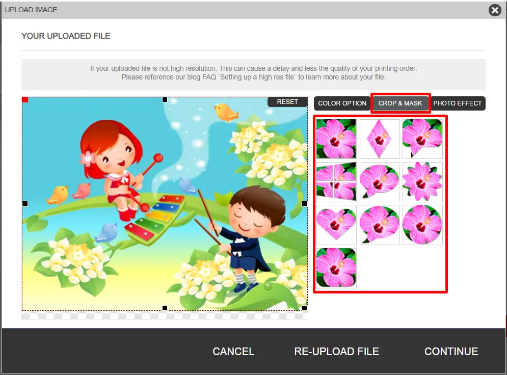
Photo Effect: There are a few photo effects available here. The customer can select the effect, and it will be applied to the uploaded image. 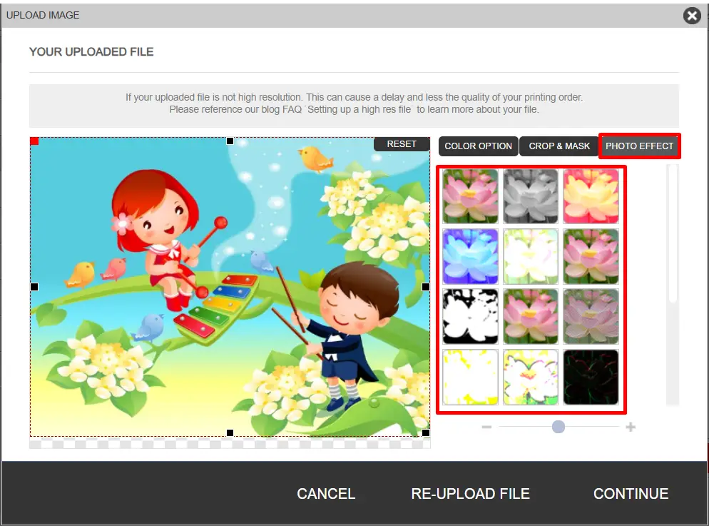
After selecting the options, click on the continue button to upload the file and place it on your product.
Name or Number Option
Commonly used for sports jerseys or personalized products where customers can add names, initials, or numbers. Customers can select size and quantity first, and for each quantity, a name and number field will be generated, and the customer can add the name & number accordingly.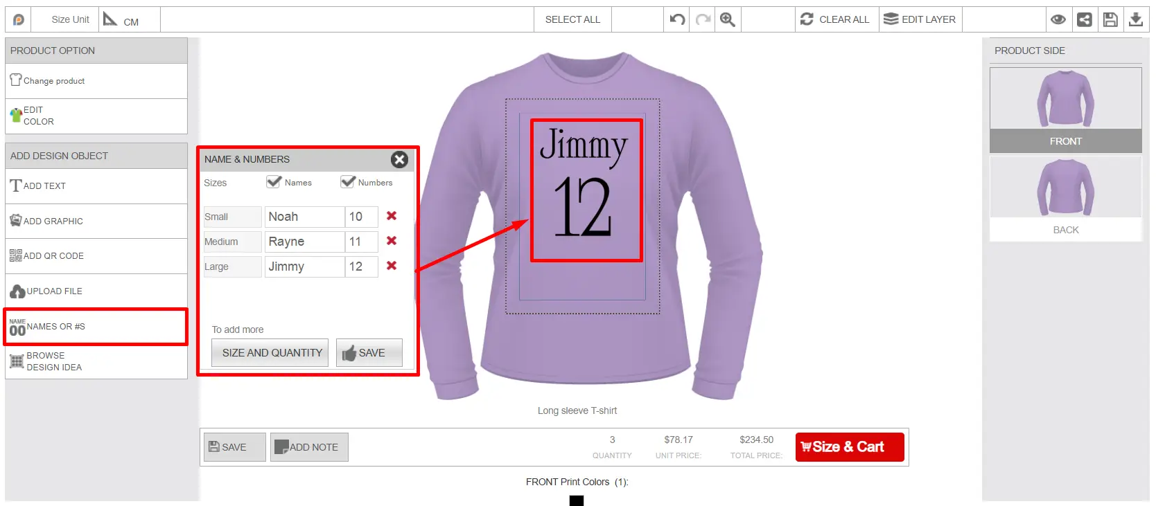
After adding the name and number, customers can easily adjust the design of the name and number, from the text options shown in the image below. For all names, the same size, design, color & other customization will be applied. The same will be for all the numbers.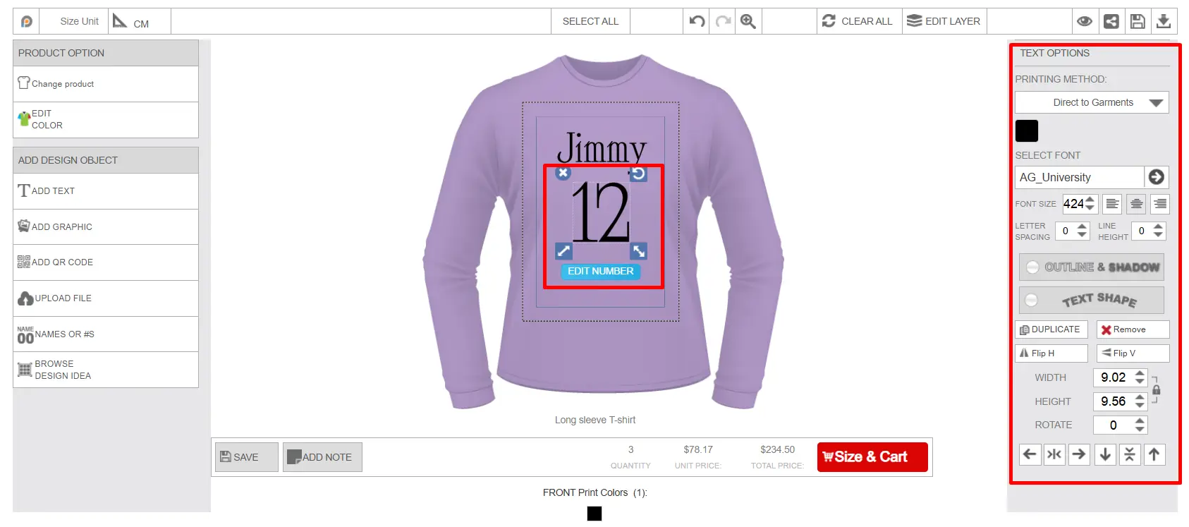
Browse Design Idea
Displays predefined templates created by merchants, which customers can select and use quickly.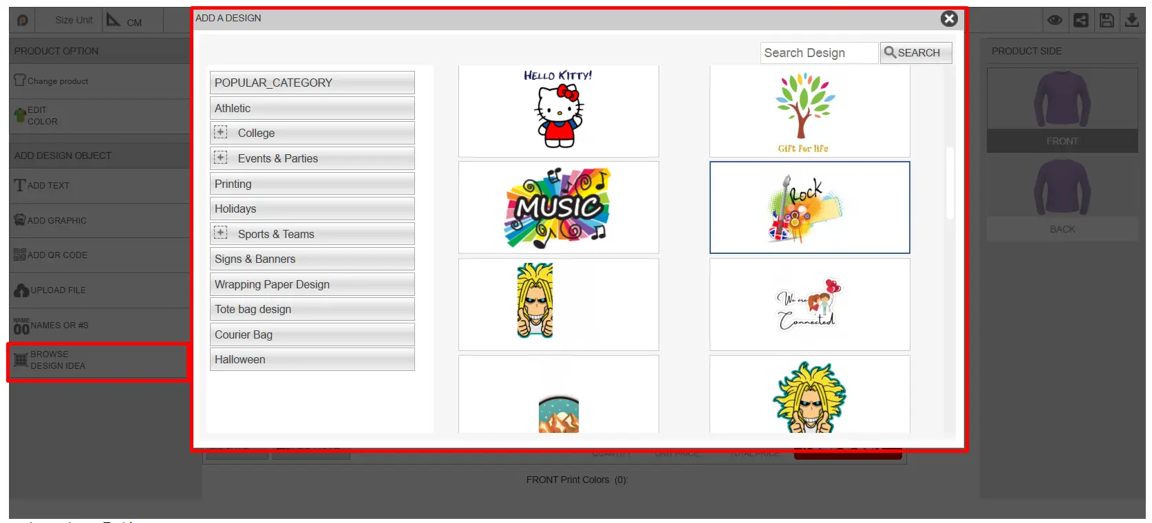
Save Button
Works the same as the save design option explained earlier. Customers can save their designed product to use later.
Add Note
Let customers include special instructions or comments related to the customization order. Customer's added notes will be included in the order file.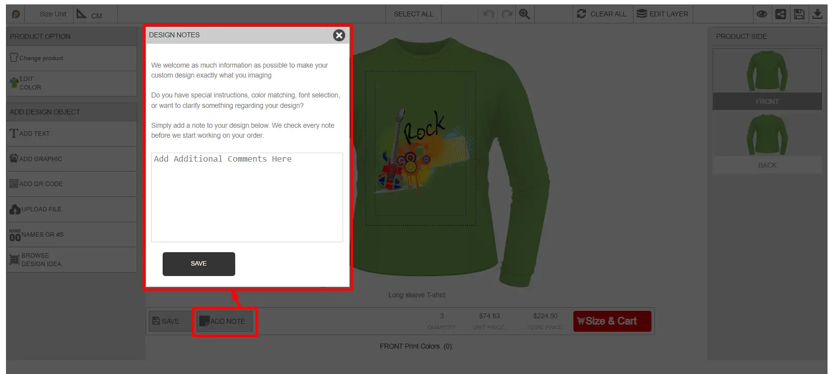
Pricing & Quantity Section
This section displays the selected quantity, unit price, and total price according to the quantity. Pricing updates dynamically based on selected customization options and additional cost.
Size & Cart Button
Opens product size selection window where customers can select the size and quantity of the product and add the customized product to the shopping cart for checkout.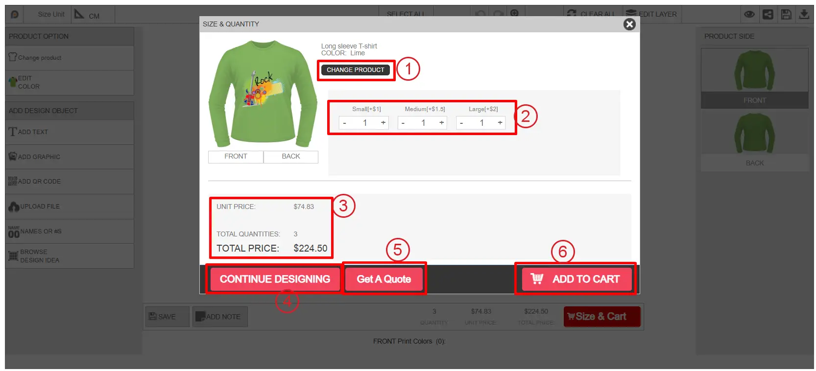
Customers can change the product from here.
Customers can select the sizes and quantities before adding the product to the cart.
Unit price, total quantity, and total price are displayed according to the selection.
From the continue designing, customers can get back to the design window to make changes to the design.
Get a Quote: From the size & quantity window, the customer can place a quote request by clicking on the " Get a Quote " button.
After clicking on this button, a window will appear with a quote form.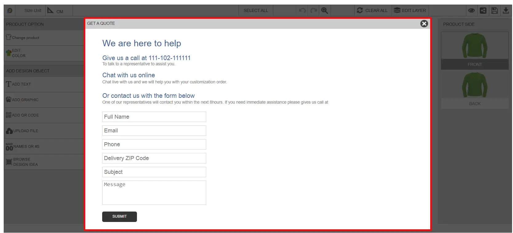 Customers need to update the quote form and submit the quote request. Customer’s submitted quote request will show inside the Inkybay admin dashboard→ Order → Custom Quote Request section.
Add to Cart: Customers can add the product to the cart by clicking on this button.
This is the overall functionality inside the designlab. All the design files and customization information, or any changes made inside the designlab will be included in the order file generated by Inkybay.
Still, facing difficulties or need help? Feel free to contact us. You can also reach us:
InkyBay app Live chat
Support ticket from the InkyBay app
Email to support@productsdesigner.com
 Getting Started
 Products
 Designs
 Templates
 Configuration
 Printing
 Orders
 Inventory Management
 Settings
 Packages
 Uninstallation
 Tutorials
 FAQ
FAQ